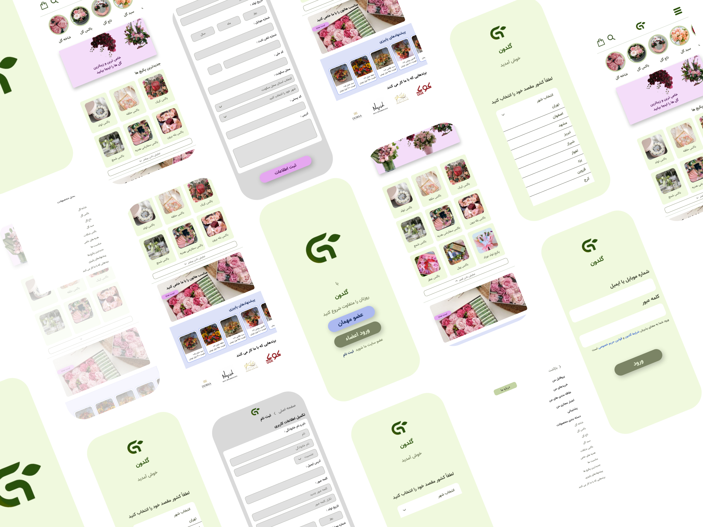
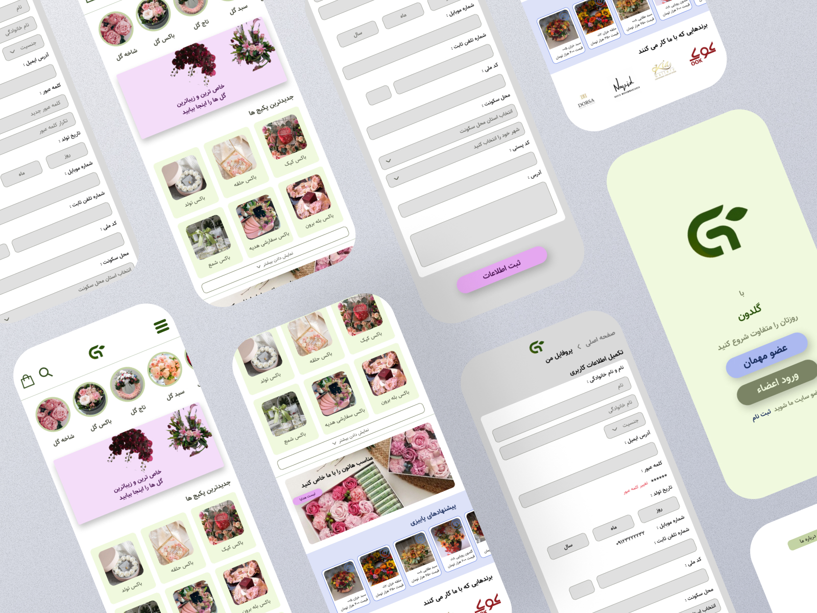
The Challenge
Create a mobile app where users can:
- Register an account
- Browse a wide variety of floral arrangements and gift boxes
- Pay securely in-app
- Schedule delivery as quickly as possible
My Role
I was responsible for the entire design process, from early concepts to high-fidelity UI:
- User experience design — researched competitors, mapped user journeys, and built wireframes.
- Browse a wide variety of floral arrangements and gift boxes
- Pay securely in-app
- Schedule delivery as quickly as possible

The Process
- Studied floral e-commerce apps (both Persian and global) to identify best practices and local design nuances.
- Created more than 20 mobile screens to cover the full shopping flow, from onboarding to check out.
- Primary (green) for growth and trust
- Secondary (blue) for calm and reliability
- Tertiary (pink/purple) for romance and celebration
- Designed clear state changes for buttons (default, hover, active, focus) to enhance touch feedback.
- Selected Neometric, a clean, modern Persian typeface, for readability and a premium look.
- Built a typography hierarchy for headlines, product names, and pricing to make scanning easy.
- Designed product cards that highlight flowers attractively while keeping prices and details clear.
- Used soft backgrounds and rounded shapes to reinforce the brand’s welcoming tone.
Obstacles
Persian Layout Constraints
- Right-to-left typography meant I had to rethink visual balance compared to Western design templates.
Color Balance
- Green dominates the brand identity, but too much risked looking generic. I solved this by using blues and pinks strategically for calls-to-action and emotional highlights.
The Outcome
The Goldun mobile design includes:
- Over 20 mobile screens covering the complete shopping experience
- User onboarding, product browsing, filtering, and checkout
- Culturally localized UI with right-to-left flow and Persian typography
- A visually distinct, nature-inspired palette
Reflection
Goldun taught me that designing in your own language still comes with challenges — typography spacing, icon placement, and layout rhythm all change in a right-to-left interface. It also reinforced the value of small details — like button states and color accents — in making an app feel polished and trustworthy.
