The Challenge
Design a cross-platform experience for:
- Mobile app users on the go
- Tablet users who want a larger, touch-friendly view
- Desktop web users who browse and order from home or work
The system had to handle:
- User registration and profile management
- Browsing a rich product catalog with cakes, cookies, bread, and more
- Online payment and instant order confirmation
- Delivery within ~30 minutes
The key challenge was to balance speed with indulgence — users should feel hungry and confident in the service.
My Role
I was responsible for:
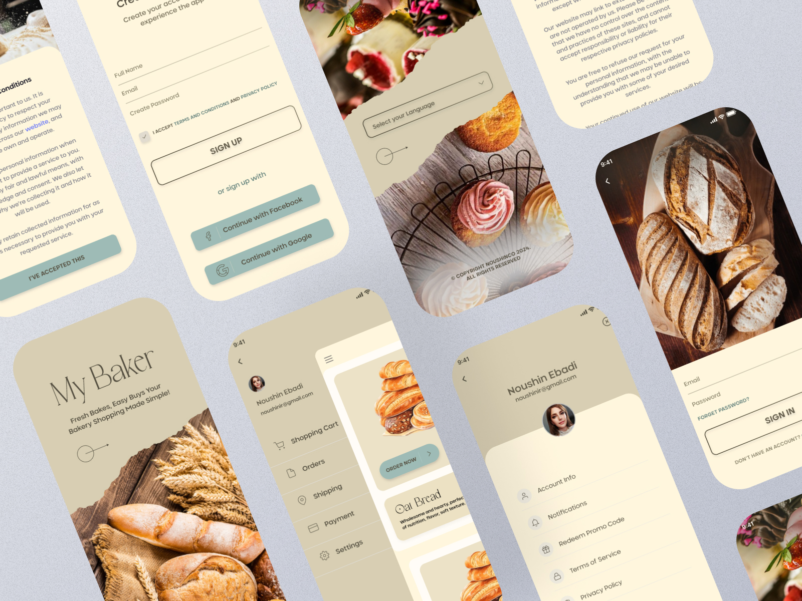
- UX design — mapped user journeys for all three platforms, ensuring consistency and efficiency.
- UI design — applied a cohesive color palette and typography across devices.
- Component creation — built reusable product cards, category filters, and checkout forms.
- Responsive adaptation — designed layouts for mobile, tablet, and desktop without losing brand personality.

The Process
Research & Wireframe
- Studied bakery and food delivery platforms to identify trends in product photography, checkout flow, and urgency indicators (e.g., “Ready in 30 minutes”).
- Created wireframes for all three device types, focusing on platform-specific user needs.
Color Palette & Typography
- Selected warm, inviting colors inspired by golden bread crusts, chocolate tones, and cream fillings.
- Chose typography that feels handcrafted yet readable — reinforcing the artisanal brand identity.
Component System
- Designed product cards with large, high-quality images, price, and quick “Add to Cart” actions.
- Built category navigation for easy browsing by bread type, cakes, or cookies.
Multi-Device UI Design
- Mobile app — fast, thumb-friendly navigation for quick orders.
- Tablet — expanded product grids for browsing multiple items at once.
- Web — wide layouts for immersive browsing and promotional banners.


Obstacles
Maintaining brand warmth across devices
- the design had to feel artisanal without becoming cluttered.
Consistency without uniformity
- each platform had different UI patterns, so components had to adapt while keeping the same “Bakery” feel.
The Outcome
The final design delivered:
- A consistent cross-platform experience for mobile, tablet, and desktop
- A visual identity that blends warmth, freshness, and professionalism
- Over 30 screens across all platforms, covering onboarding, browsing, checkout, and order tracking
- A layout and system ready for development handoff
Reflection
Bakery taught me that multi-platform design is a balancing act — you can’t just shrink or stretch layouts. Instead, each device type needs its own tailored experience, all tied together by a unified brand language. It also reminded me how much color and typography choices can influence appetite and trust in food-related platforms.
